Drive donations and support
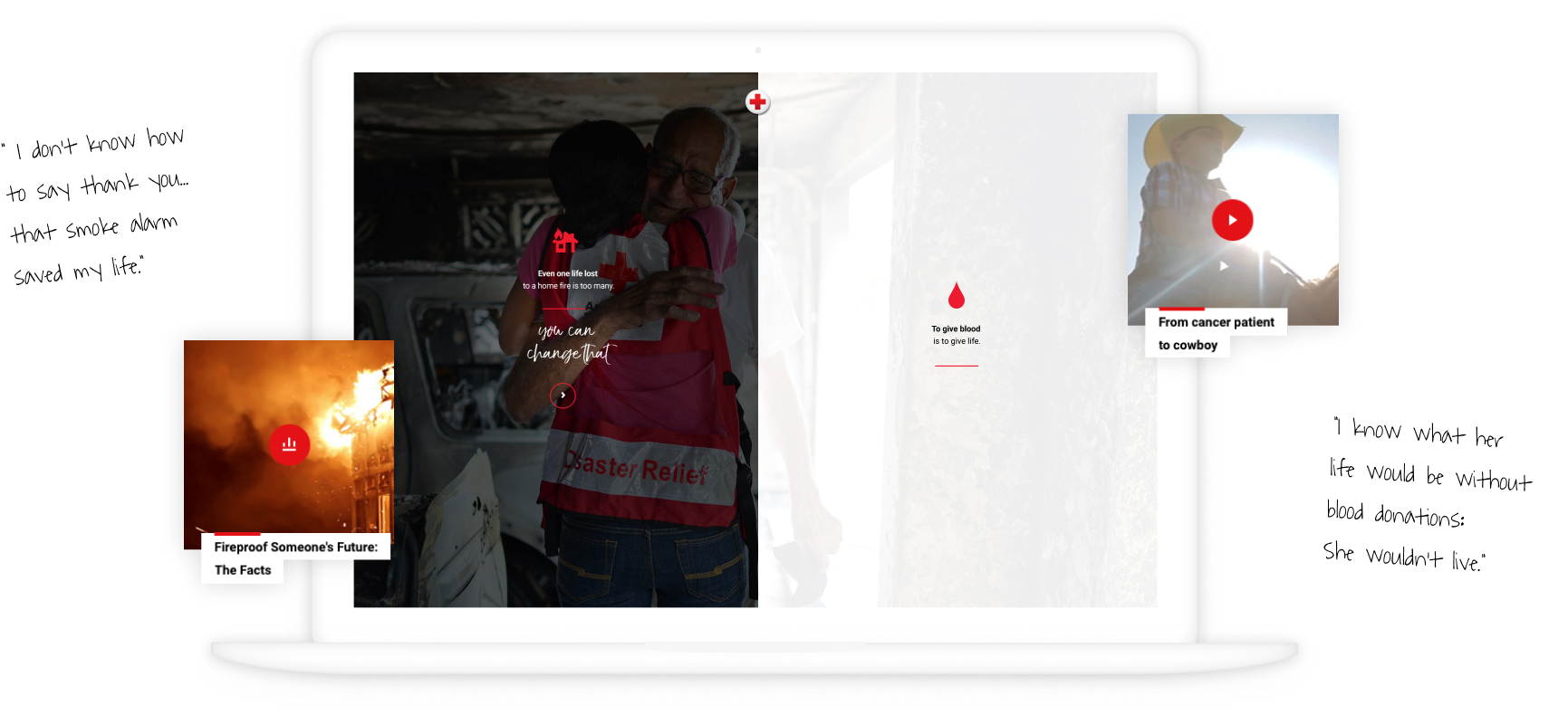
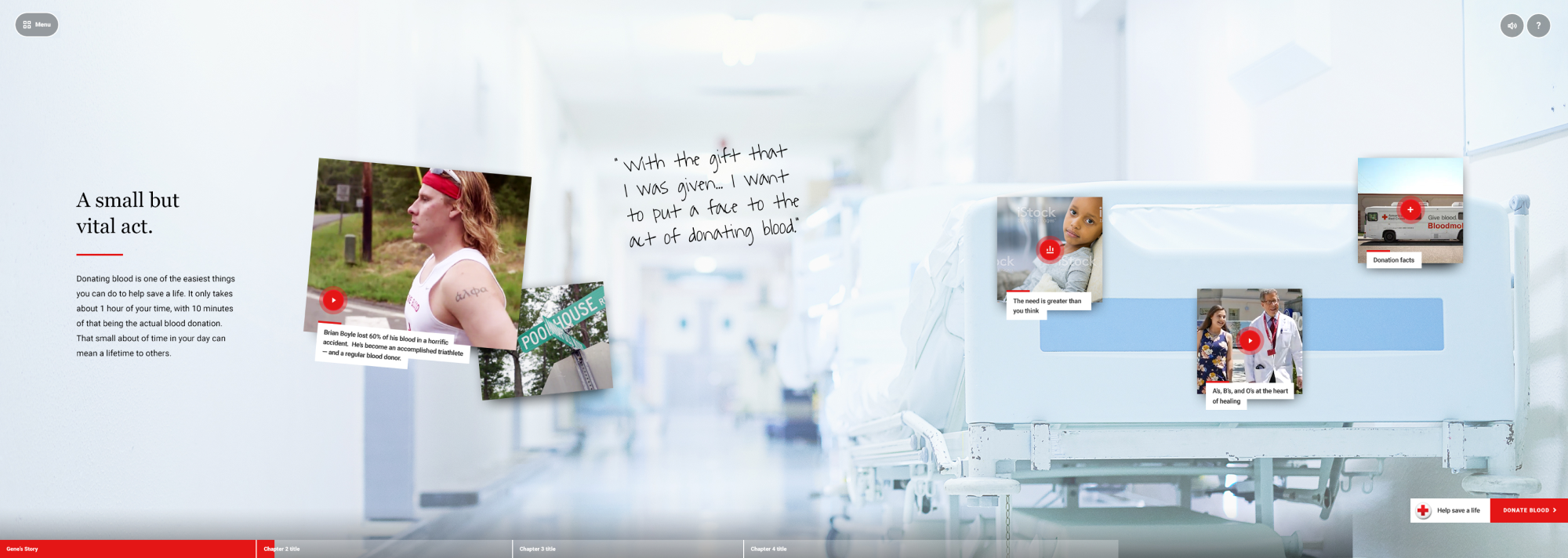
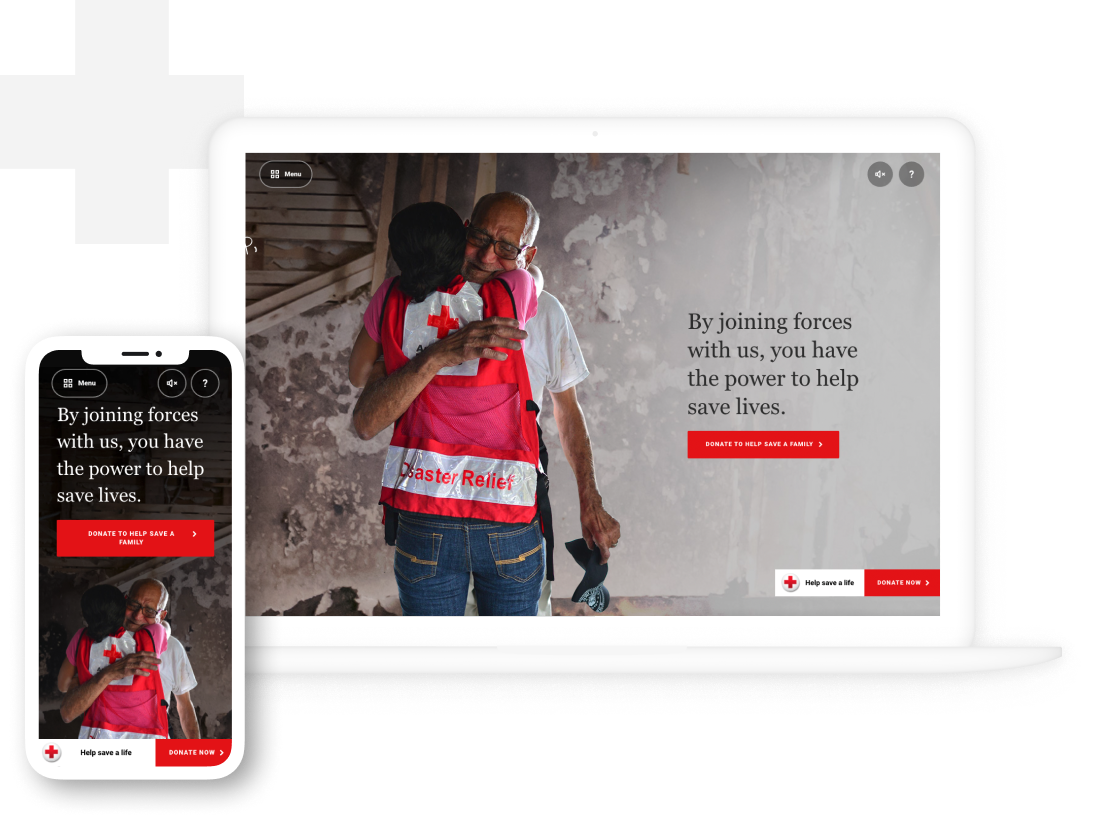
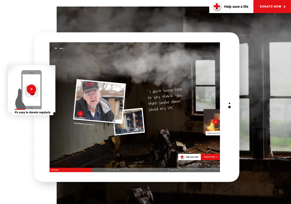
The Red Cross wanted to share the website on tablets at different touchpoints, such as public events and blood drives, so we made sure that the horizontal-scrolling experience was seamless across platforms. Sticky “donate money” and “donate blood” calls-to-action help to drive engagement, so that people don’t forget that they can be a literal lifeline.


